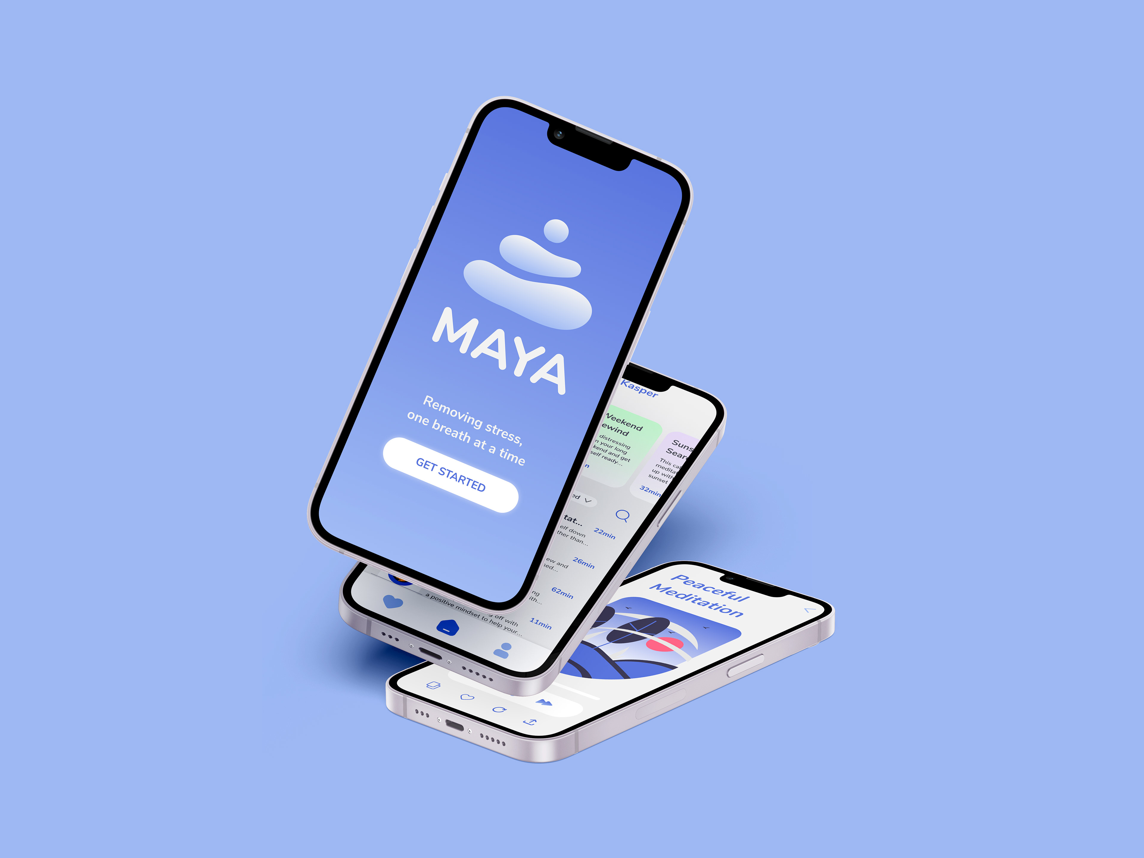
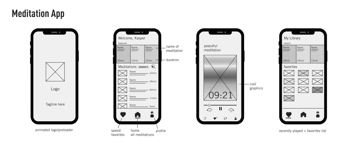
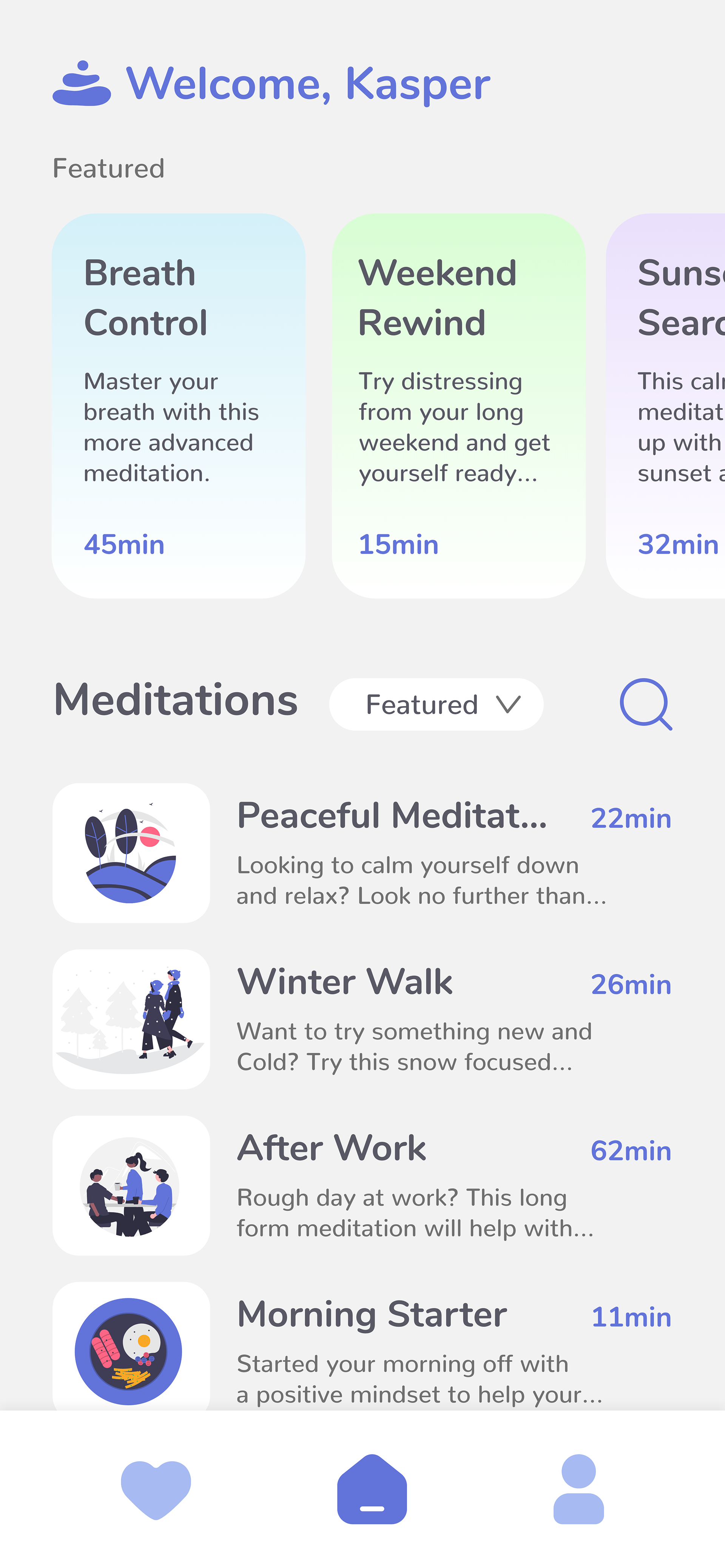
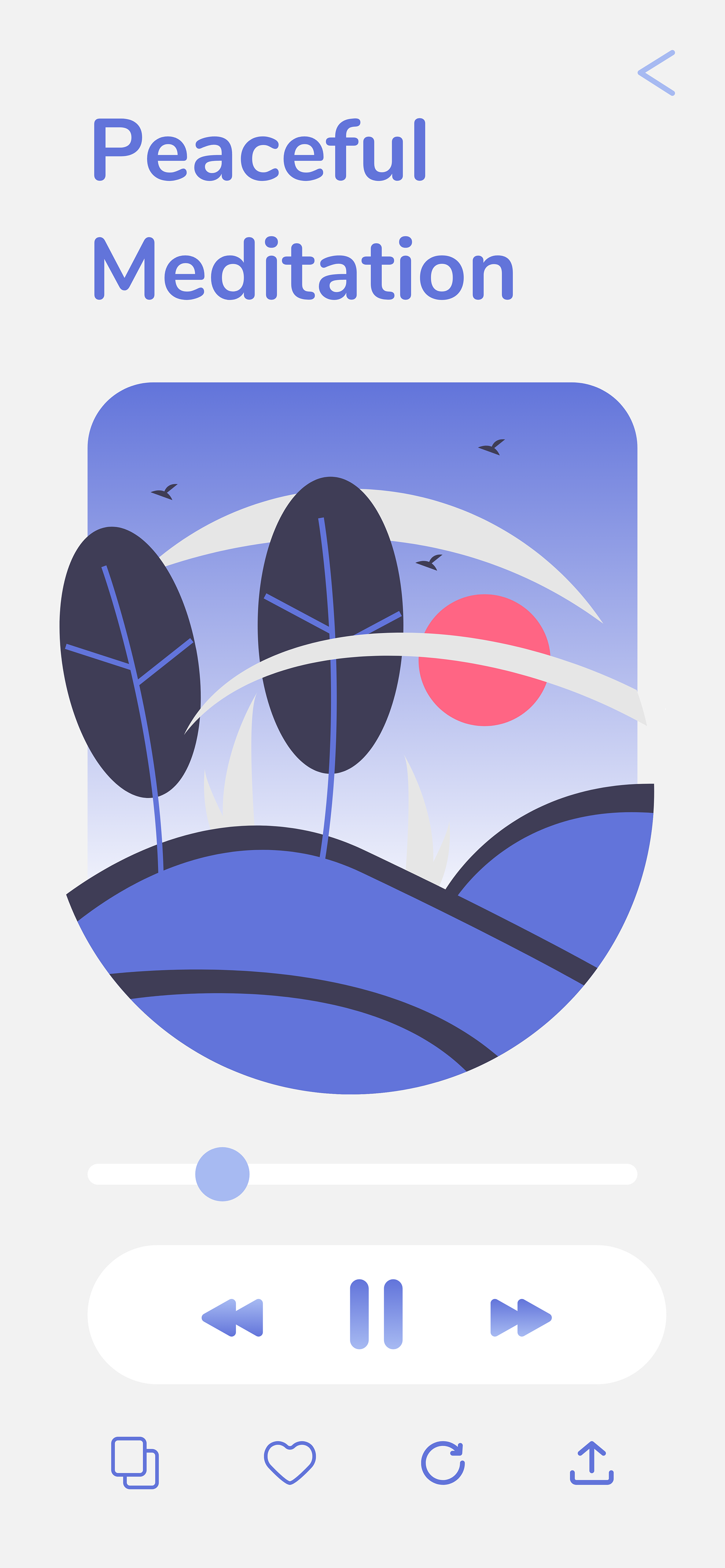
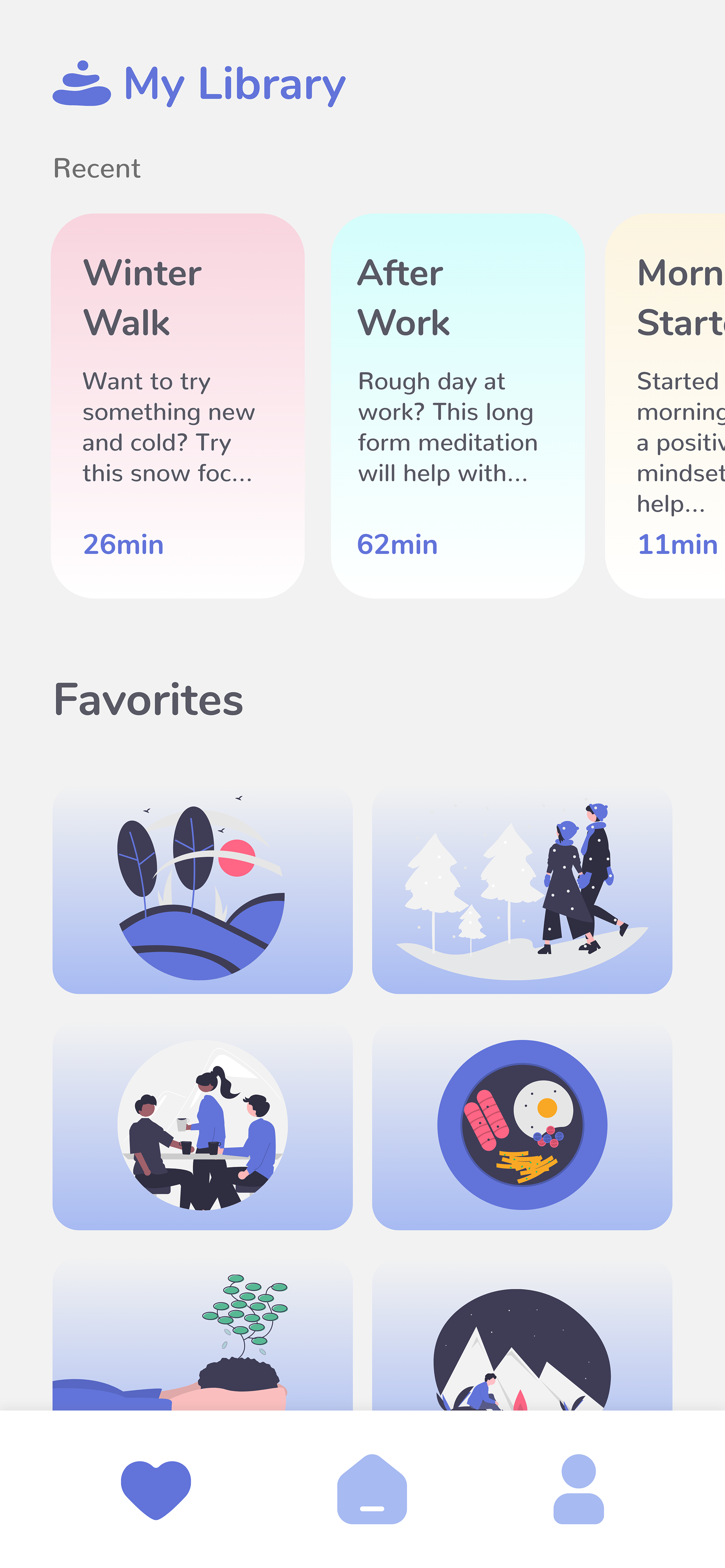
MAYA is a fictional meditation app I created the user interface for as well as some animations for various parts of the interface. For this project I worked as the user interface designer and animator. I was given mid fidelity wireframes for 4 of the main screens for the app and from there I had to create high fidelity screens that could be used for animation mockups. I was also tasked with defining the brand values and making sure they are carried out throughout all aspects of the design. Some other requirements I was given include the target audience. The target users for the meditation app are young people who are having issues with stress and want to find smart solutions to use at home and/or at work. They are from 25 to 40 years old and avid smartphone users.
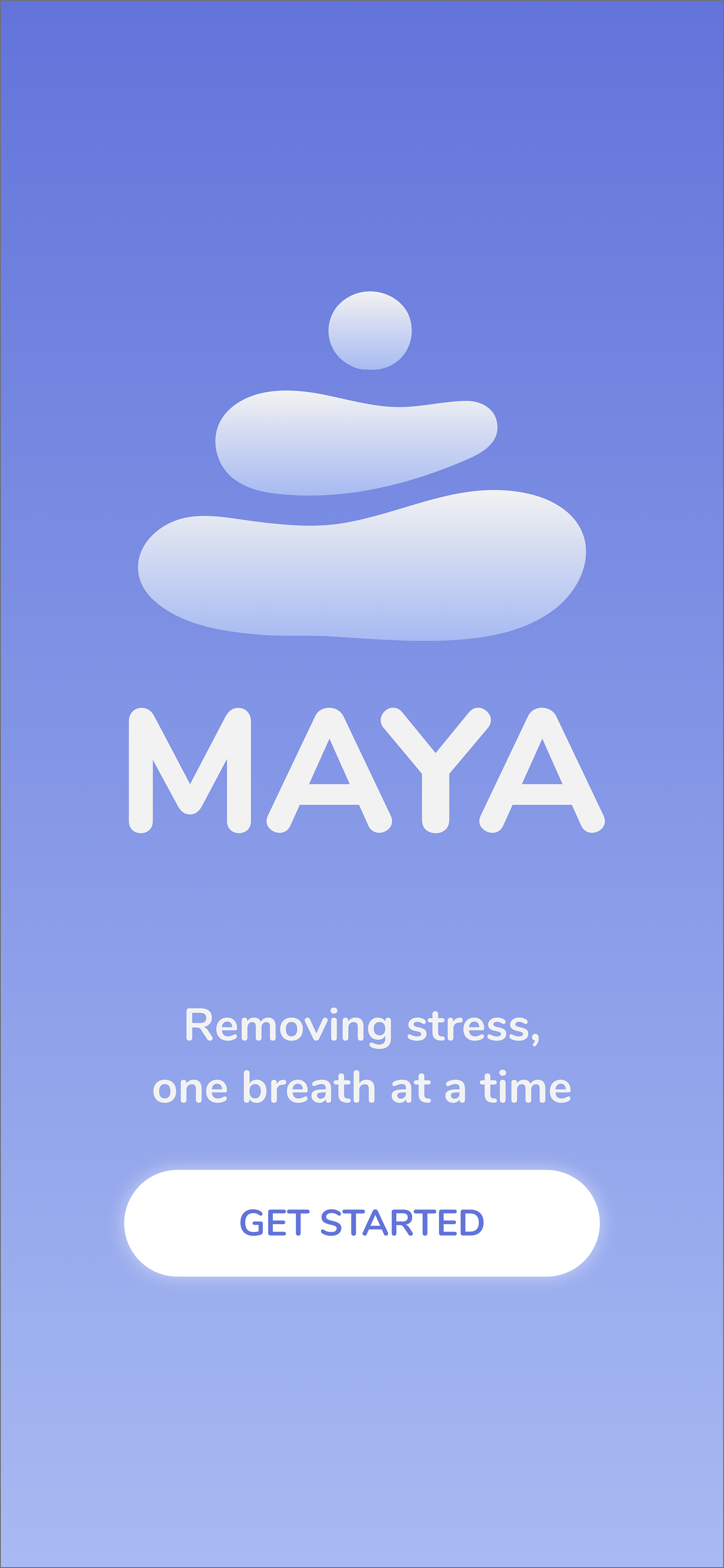
With all of this information given from my brief I went ahead and thought of the core values for the app. The core values I defined for the app were balance, peace, and mindfulness. A couple ways I wanted to incorporate these values into my designs include, rounded corners, soft colors, lots of white space, no distracting elements, and simple layouts. Since I was creating a meditation app that was supposed to help with stress I wanted to the app to look and feel as soothing as the meditations users would listen to.
After designing the interface for the app I had to start thinking about animations. By keeping my core values in mind I new I wanted to create transitions between screens that were simple and calming. I wanted to keep things pretty low animacy in order to not distract the user's attention too much. I also wanted all of the animations to feel natural and be on the slower side. With those principles in mind I went ahead and started storyboarding.
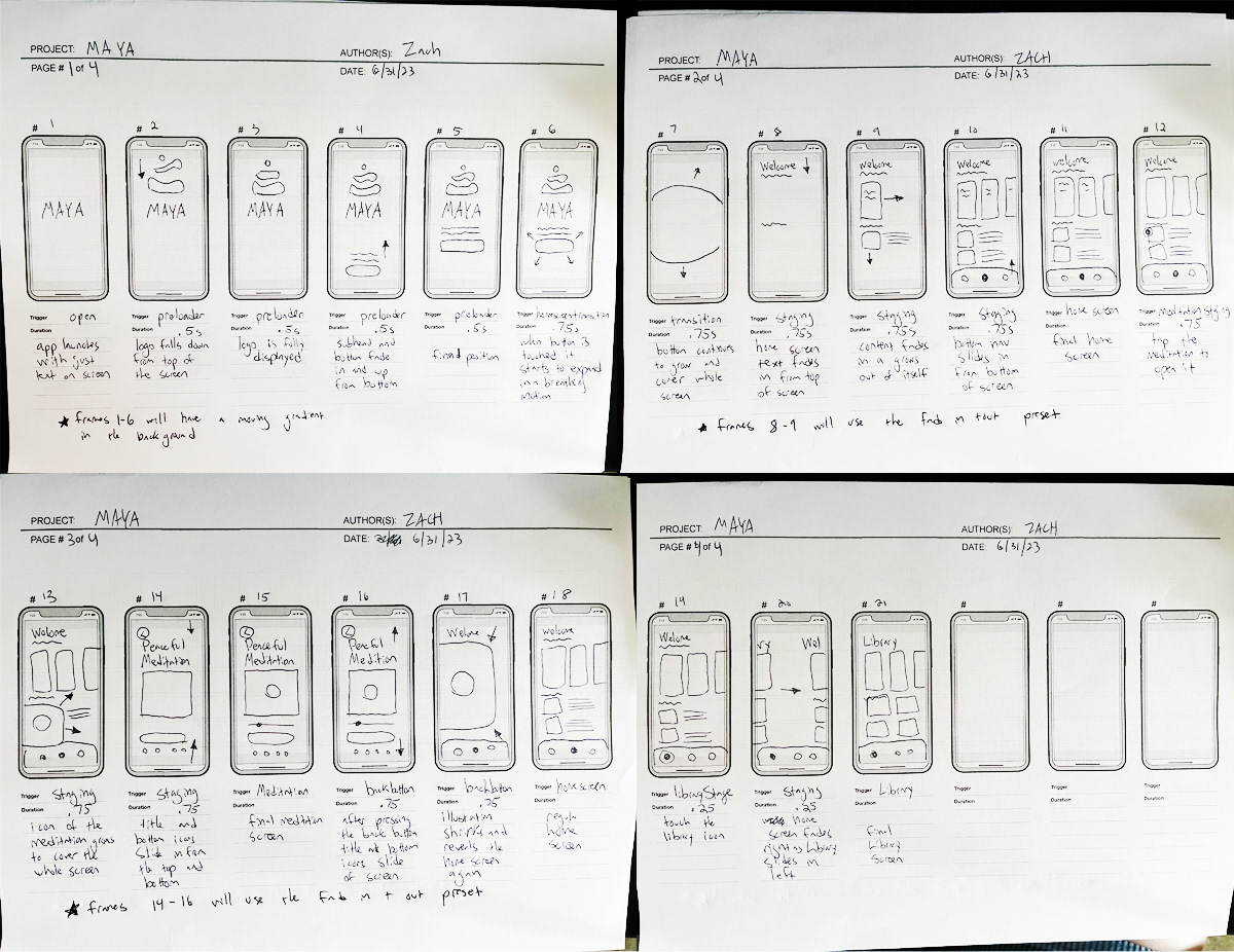
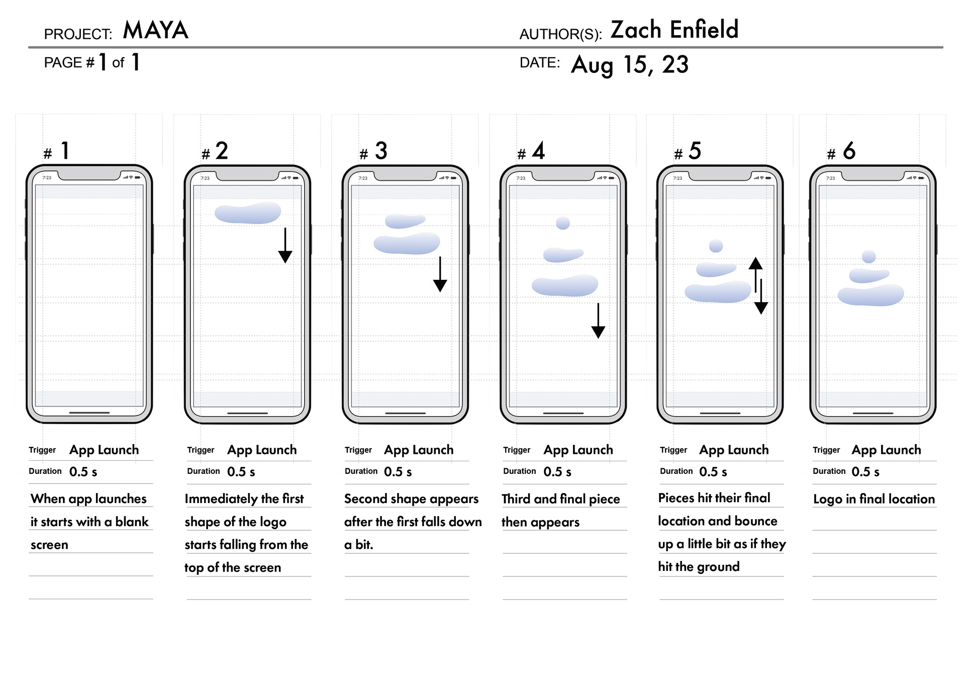
Some motifs I want to highlight in my animations include the idea of expanding and shrinking. This concept came to be when I was thinking about one of the key parts of meditation, breathing. When we breathe our lungs expand and collapse. I thought this would be a cool way to tie the animation into my core values as well as the subject of the app itself. I incorporated this idea in some of the transitions, most notably when click through the app launch screen as well as when clicking into one of the meditations. Another area of the animation I would like to highlight is the subtle use of 3D on a couple elements. When the meditation screen loads in the large bar with the play and skip buttons rotates in 3D. Similarly when the icons on the main navigation are clicked they rotate in 3D as well. Both of these occasions are very subtle in order to keep with my brand values. You can see my whole animation bellow.
Besides the transitions between screens I also created a custom logo animation for the pre-loader screen. I wanted this to be a simple, short, and friendly animation that brings life to the logo and helps reinforce the brand. I felt like the logo falling down from the top of the screen with a little bit of bounce would nicely fit the brand I had created. I created a story board for this to quickly layout my idea before executing it.