
One of the projects I have worked on for POS Supply Solutions was to create a new logo for their outreach initiative. To quote their website, "POS Supply Cares is about making a positive impact on both people's lives and the environment. Our team firmly believes in giving back to the communities we serve and minimizing our ecological footprint." I was tasked with creating a new logo that tied into their original branding but also helped convey the message of POS Supply Care.
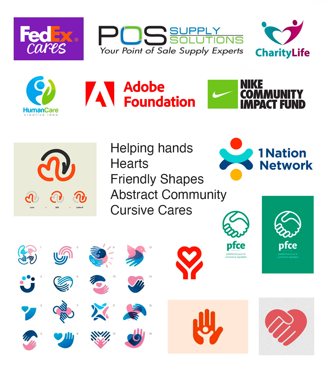
The first step I took in the design process was to do some visual research and see what other companies do as far as outreach logos. I also looked around online to see other ideas for charity logos as I felt they would have a similar to feel to what I was looking for.
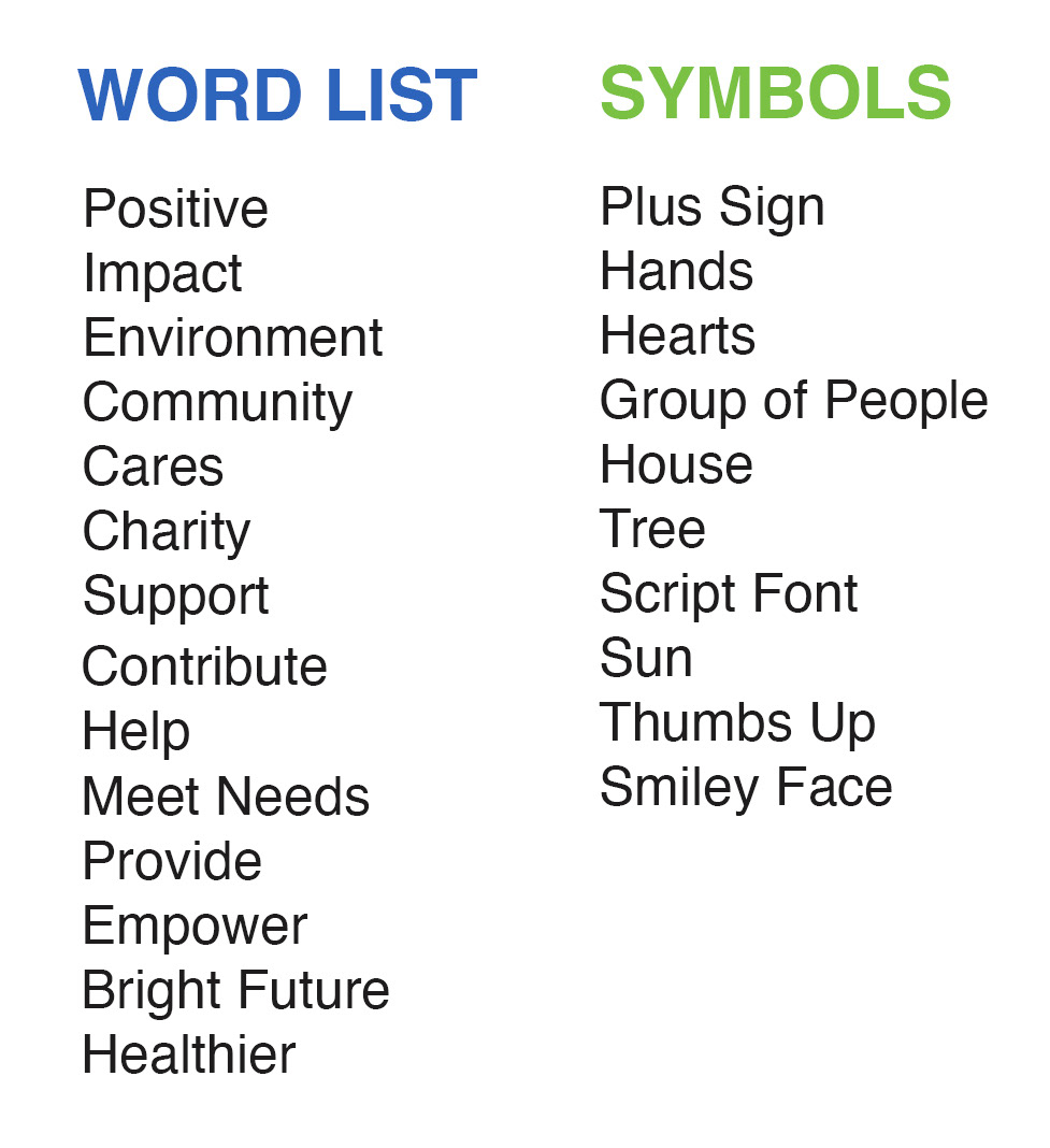
After compiling my mood board I started to do some brainstorming. The tool I used was word association. Using my visual inspiration as well as the goals of POS Supply Cares I tried to think of as many words that related to the theme as I could. That then left me with this list.
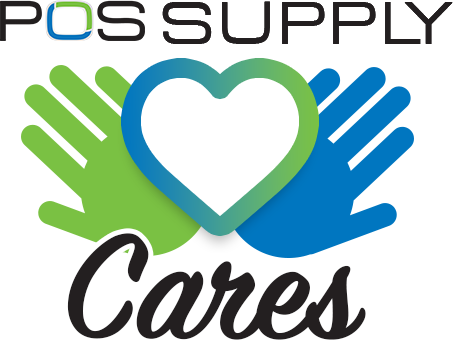
At this point I started putting pen to paper and began sketching out rough ideas based upon my brainstorming and visual research. When sketching I like to draw anything and everything, I try not to worry about quality here and instead focus on getting all my ideas out. Sadly I miss-placed my sketches and don't have them to present. You can just imagine a page or so of random scribbles just ready to start being refined. After picking out my favorite few ideas I took things over to the computer. There I roughly fleshed out 4 ideas to present to the client in order to get their opinion before moving forward. Those 4 designs can be seen bellow.
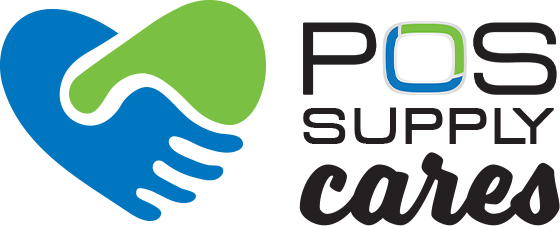


After sending the client these ideas we worked together through two iterations to finally come up with a solution that combined two ideas into one. I was able to use the feedback I received as well as the design work I had done prior to find a solution that looked good and met the clients needs.
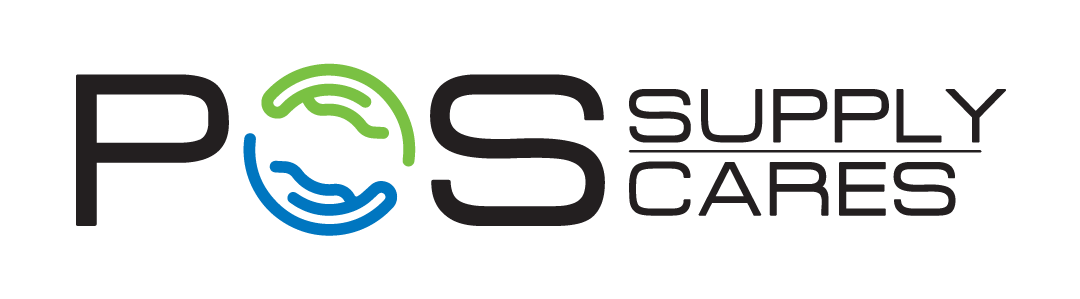
I think this final solution works very well. First of all, it clearly aligns with the company's previous brand and logo. The same font, colors, and text treatment really help this feel like an extension of the existing brand. Secondly, the almost abstract rendering of a helping hand lets the viewer know the point of the logo without even needing to see any text. Not only does it portray the initiatives goals but it also resembles the previous logo with the treatment of the letter "O". If interested view the page on their website here:
https://www.possupply.com/pos-supply-cares